For more than 50 years, the Delaware Department of Natural Resources and Environmental Control has worked to protect, preserve, and enhance Delaware’s environment for current and future generations. The key to DNREC’s efforts is our shared mission. We all must contribute to a shared brand experience, one that educates, engages and inspires others to support this important mission.
That’s why, in 2021, the Department unveiled a refresh of its brand and visual identity. The refresh builds on the Department’s history of commitment to responsible use and protection of the natural environment. It includes a new logo, vibrant color palette, versatile typeface and modern illustration style.
This webpage provides guidelines for each element.
Several names are used to represent the Department. The full name of the state government agency is the Delaware Department of Natural Resources and Environmental Control. Use the full name on first mention. Colloquially, most people refer to the organization simply as “DNREC.” [Pro: dɛn rɛk] Or, if it isn’t an in-state reference, “Delaware DNREC.” A phrase such as “the Department” is also acceptable, but should also only be used on second reference. In general, Department is preferred to agency.
DNREC has several divisions, sections and programs. The names of these units are preceded by DNREC in the first reference, e.g., the DNREC Division of Fish and Wildlife. There are a few exceptions, to include: Delaware Natural Resources Police, Delaware (or State) Energy Office, Delaware National Estuarine Research Reserve and DuPont Nature Center.
In addition, there are two ways to refer to the state park system. The DNREC Division of Parks and Recreation is the official government unit within the Department and should be used as it relates to the budget, operations and/or staff. Delaware State Parks is the consumer/tourist-focused name to refer to the places people visit to enjoy the outdoors.
The brand is visually organized around the DNREC name and logo with complementary secondary logos for each division. All follow the same design standards and provide a unified brand identity to help Delaware residents and visitors understand the broad mission and work of the Department.
The Department and division sub-brand (or “secondary”) logos are available for purposes acceptable to the agency. Never redraw or alter the logo, including the placement and size relationship of its letters or center image. It is not to be warped or stretched out of proportion. The logo may not be used in a way that implies endorsement of any organization, idea, product or service.
The logo highlights our natural resources, showcasing a rising sun along with three realistically rendered Yellow Poplar trees to represent the three counties in Delaware.
The shapes and proportions are determined using the golden ratio proportions which are often found in nature.
This logo is built to be responsive, meaning the logo is designed in different orientations or lock ups to fit popular uses.
Official Seal

Vertical Logo

Horizontal Logo

Mark

The DNREC logo should have a specified clear space around the graphic. The vertical and horizontal logos have the size of the “D” within the word “Delaware” as a guide for how much clear space to include around the logo. You may add more space if that is available. The mark’s clear space is treated similar to the seal’s clear space, described above.

DNREC employees can download the logo files from the shared drive. External groups may request the files from Christy Shaffer at christy.shaffer@delaware.gov.
The primary brand colors appear in the logo. The earthy green symbolizes freshness, growth and balance while the blues represent serenity, stability, inspiration and wisdom. The show-stopping vibrant yellow promotes hope and happiness.

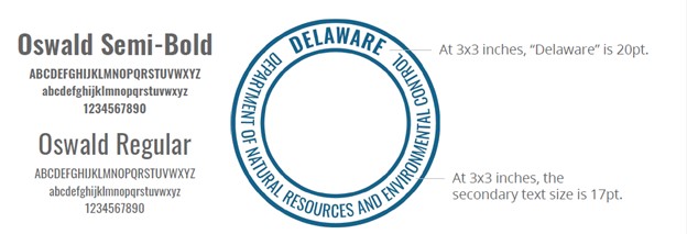
The logo font is Oswald Semi-Bold and Oswald Regular. Lato is the Department’s sans-serif font.

Have you seen other logos in the wild? You may have seen a version of the logo from earlier years.

Related Topics: brand, communications, dnrec, identity, logo, organization, typography